Mythos & Marginalia

2015 – 2025: a decade of days


  • See The Need

    The seasonal lights dim, holidays soon will draw to a close, and we return to day-to-day living. Still we cannot forget circumstances, and the need for giving.

    So many of us are fortunate to have a roof over our head, food in the fridge, and money in the bank. Sadly, others are not.

    We all see the need.

    We live in uncertain times. In this vast global community, or just down the street, we all know of needs that current resources will not meet. Budgets are stretched, programs require increased funding, and, more than ever, we are being asked to help our fellow beings.

    Choose a charity, or two, and provide what you can. Money is good, but so is your time.

    Not a hand out, but a hand up; a familiar adage we have all heard before. Regularly, but more so in the festive season, we are asked to help those unable to care for themselves.

    This season of sharing is the season of caring, and we cannot simply stop.

    Keep giving, continue living , and remember the spirit of the season is more than forgiving.

    Do your part, do what you can. Know your heart and lend a hand.

  • Always

    Your whisper fair warns us, yet still
    we are surprised. The calendar’s last page,
    and we are left feeling more. Always.
    Winter: a beginning comes near the end,
    while the end craves new beginnings.
    The longest season, physically, or
    spiritually. Consistency, year over year,
    over year, from one into the next.
    Cold, as it is darker. Light is appreciated,
    and necessary. We grow up knowing,
    the facts of this season. Always,
    our lives marked by winter.
    Time, and years, have become forgotten,
    but we are reminded. The soil
    and silence, frozen. Our insular existence,
    non-secular pain, wind-chafed emotions,
    a reminder again. We desire
    a warm touch; December, January or
    otherwise. Hope, as with autumn’s last leaf,
    dangling in a greater stillness.
    A confessional. Always. Dormancy
    until early spring, what we allow or when
    we embrace. Silence. Darkness.
    We need not be surprised.
    Impulse knows. We have been here before.

    ©2017 j.g. lewis

  • Anything But Ugly

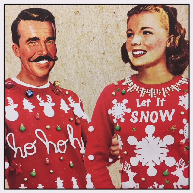
    What is so offensive about clothing that celebrates the season?

    I am familiar with the trend over past years to mock seasonal sweaters; it is often included in the banter of shock-rock disc jockeys and morning show hosts looking for laughs, or the rants of unoriginal stand-up comedians filling allotted time at comedy clubs across the country. And, yes, it is supposedly in jest, but at the heart of it all is the need to poke fun at a clothing style, and ultimately at those who choose to wear the garments, past or present.

    It has become humour of the lowest common denominator; jokes that go past what people wear, to attacking what many people consider the most wonderful time of the year.

    Adorning a seasonal sweater is a personal choice, like any article of clothing we may (or may not) wear. Some, in fact many, people enjoy bringing out certain sweaters to celebrate the season. It is their way of brightening the days and weeks of the holiday season. To these people, the season is not ugly; the sweaters are not ugly.

    But ridicule? That is ugly.

    My mother used to wear seasonal sweaters. This was in the ‘70s, and I was wearing ultra-wide flare jeans and sky-high platform shoes. Was it ugly, or simply the fashion of the times?

    Beauty is in the eye of the beholder, as is ugliness. Beauty is subjective, so when clothing is a matter of mass production, the “ugly” sweater one person may select could be something totally delightful to another.

    Five years ago I watched a mother with her teenage special-needs daughter sorting through the racks of sweaters in a department store. Overly bright, and obviously seasonal, these sweaters were adorned appliqués of snowmen, candy canes, Christmas stockings, and all those familiar festive images. The pair was searching for matching sweaters with blinking lights, and they were laughing, giggling, and enjoying a mother/daughter moment.

    I realized, as I watched the glowing smile on the daughter’s face, that these “ugly Christmas sweaters” were anything but unattractive, unpleasant, or morally revolting. These sweaters were totally special, and exactly what they were looking for.

    So what, in the eyes of some people, makes these sweaters ugly?

    This is the time of year people chose to decks their halls with boughs, bells, garland, and fake snow. Coloured lights on houses and trees light up neighborhoods. Is wearing a sweater that highlights the season really all that different? Yes, some of the sweaters are somewhat garish, (certainly not my style), but why should I be critical, especially this time of year.

    Why call these sweaters “ugly”? Why not call them “festive”, as what they display, and what they represent, coordinates so well with everything else that surrounds us in this overly-commercialized time of the year.

    There are office parties and ‘Ugly Sweater Days’ at local businesses. Do the people who plan these events not consider how these actions may be interpreted by others? Why risk offending a customer? What about those coworkers who fear wearing a favourite sweater for fear of ridicule, gossip, and back talk at the office?

    Is there really a place in our workplace for degrading or demeaning people for what they wear? Do we honestly need to have a day to make fun of personal taste? Along with food and shelter, clothing is considered a basic need; is it something to be attacked?

    Yeah, yeah, yeah. . . I have told – and laughed at – my unfair share of tasteless (even racist) jokes. I am not innocent, nor am I politically correct, prudish, or proper. I enjoy sarcasm, humour and comedy (especially dark), and believe laughter can, and will, lighten up a moment. But laughter at the expense of others? I think not.

    We already live with enough “ugly” in this world. The drastic effects of climate change starving polar bears: that’s ugly. A self-obsessed, self-confessed pussy-grabbing president who flirts with nuclear war between tweets and tantrums: that’s ugly. The fact there are people in our communities who cannot put food on the table, or have no place to call home. . . that’s really ugly.

    A soft, colourful sweater that offers a smile, and warmth to a society that has growing cold, is anything but ugly.

    ©2017 j.g. lewis

  • Sending The Message

    It is a sign of the season delivered to your door, a colourful custom that informs and brightens spirits, and a tactile reminder that someone is thinking about you.

    Sadly, in the age of instant communication, the Christmas card is something we see less and less of as time passes.

    The practice is centered around one of the big days on the Christian calendar, but it is really something bigger. Beyond faith and religious affiliation, the seasonal card is a means of connecting with the people you know, or love, worked with, or worked for. Sometimes it’s the only time you communicate with some of those people, and often it is marked with a special stamp.

    The Christmas stamp, itself, often shows how the season is celebrated.

    Canada Post, each year, produces both a spiritual image and a non-denominational, seasonal series celebrating Santa or snowmen, sleigh bells and the lighter side of the season. Canada issued the first Christmas stamp in 1898; not just a first for the country, but for the world.

    Earlier this year a dear friend sent me a large parcel of cancelled stamps, knowing I collect these delightful samples of art, culture and history. While I’m not an obsessive philatelist, I will admit this is but one of my somewhat nerdy passions. I have long been fascinated by the range of imagery found on stamps from around the world. I’ll also admit to being especially fond of the Christmas issues.

    While society’s main method of long-distance communication has shifted progressively from handwritten cards and letters to e-mail, the object behind sending Christmas cards is the same as it was in the 15th century; a wish for good luck in the year to come.

    I remember my mother, each year, parking herself at the dining room table with her address book and boxes of cards to write to lifetime friends across the globe. She enjoyed sending the cards as much receiving them. If you’ve received a Christmas card in past years, you know the warm feelings tucked inside the envelope.

    Maybe this year is a good time to spread seasonal joy in the more traditional method? Why not send wishes to a few favorite people? You may even want to tuck one of those photocopied family newsletters inside the envelope, just to let everyone know what you have been up to.

    It’s not sending the card that matters, as much as sending the message.

  • What You’ve Been Looking At

    Look closely.
    You may have to — depending on which screen, tablet, or device you are reading this on — because how it is presented is not how it was intended.
    Things are not always as they appear.
    It’s not like it used to be, where at one time the size of the text you read to obtain information and entertainment was consistent, but lately you may even have to squint to stay informed.
    It used to be about the pica.
    You know, the pica? Sure you do; the pica was the standard unit of measurement for the copy you read in newspapers, magazine, books. Okay, it was more industry jargon, but you, in selecting the size of font to write or print a document, made use of this measurement.
    There are a dozen points to one pica, thus when you choose 12-point type, you are selecting a measurement of one pica. You get the point. As typography changed through the years, and computers replaced traditional typesetting in the 1980s, the sizing and measurement was altered slightly.
    Published documents used to deal with standard sizes. Whether it was legal or letter-sized stationery, or a broadsheet or tabloid-sized newspaper, the type sizes were consistent. The traditional printed page is now less and less important as much of our reading is done on a screen of some size or another. It makes it difficult, Much of the print we read these days is simply too small.
    It is becoming a problem.
    When web page designers and companies create sites for the retail or service sector, they are going for a certain look. They want to attract attention and appear different than everything else out there, all the while they are selling something.
    The nature of online business is to catch the eye, and in trying to do so with captivating images and layouts they are paying less and less attention to the written word and how it is read.
    All too often they are selecting fonts in point sizes that may graphically look wonderful on the screen they are designed on, but translate to something insignificant when transformed to the reader’s screen
    Do you ever wonder why your eyes are tired at the end of the day?
    Look at what you’ve been looking at.
    I recently flashed through the Apple website on my iphone. I even have the larger screen of a recent model, and still I had to “pinch” the screen at one point to increase the text size. I was unable to do so with two of the banking apps I scrolled through. I actually opted to make a transaction on my computer because the information I required was not easy to comprehend on the mobile app.
    I’m quite used to reading type, and I wear progressive lenses in eyeglasses to aid my vision. Still I was having difficulties.
    Often I find a virtual page has been designed with a larger type in some sections, but some of the sub text was almost incomprehensible.
    Yes, you can increase the size of the text size in the settings on your mobile device, but those settings increase the overall text on the screen, and that is not always required.
    Most times it is not required, nor should it be.
    Micro-sized text is not limited to computer-related screens. Forever we have dealt with tiny type on a package’s ingredients, cooking instructions, or the disclaimers and finer points to a legal contract. Do you remember how difficult it was reading the liners notes and lyrics on Compact Discs?
    There were times you even needed to pull out the magnifying glass.
    It’s a shame that, sometimes, you might need to do the same thing on a mobile device.

    Image: Testimony ©1987 Robbie Robertson